The High-End UX Blueprint: Balancing Aesthetics with Conversion
A visually striking website that fails to generate inquiries is merely an expensive digital brochure. For architects, fine art professionals, and luxury service providers, web design must perform beyond surface aesthetics—it must establish immediate authority, evoke trust, and guide visitors along a clear conversion path.
This guide explores the architectural pillars of high-end user experience (UX) design: strategic visual hierarchy, deliberate negative space, typographic psychology, cohesive color schemes, and performance-focused micro-interactions.
1. Visual Hierarchy & Scanning Behaviors
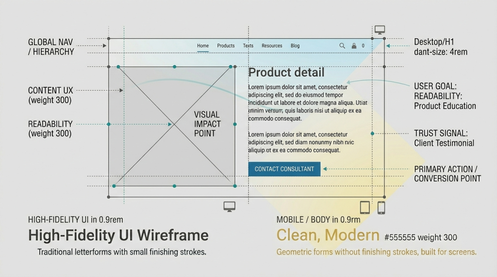
Web visitors rarely read every word on a landing page; they scan key focal points. On image-rich layouts, implementing a structured Z-Pattern layout mimics natural visual scanning paths—starting at the top-left brand anchor, scanning across to the top-right call to action (CTA), dropping diagonally down through primary media, and settling on the final conversion element.
The Visual Anchor Rule
Primary value propositions and primary action buttons must sit at natural focal intersections. If a primary CTA competes visually with dense background elements or high-contrast imagery, conversion efficiency drops significantly before the user scrolls.
2. Typography Psychology: Establishing Brand Authority
Typographic selection communicates brand tone as effectively as the body copy itself. Aligning font pairings with brand positioning reinforces visual hierarchy and professional credibility:
- Serif Typography: Communicates heritage, architectural structure, and established authority. Ideal for luxury service firms, boutique studios, and fine art galleries.
- Sans-Serif Typography: Delivers clean, modern, and highly legible text. Best suited for technical documentation, dense specifications, and minimalist user interfaces.
The Editorial Approach: Pairing a refined serif header font with a clean sans-serif body typeface establishes a classic-modern balance that remains both elegant and effortlessly readable.
3. The Strategic Use of Negative Space
Cluttered interfaces create visual fatigue. In luxury market design, generous negative space (whitespace) signals confidence, giving imagery and messaging room to command attention.
Implementation Guidelines
- Expanded Section Padding: Increasing vertical section spacing allows portfolio items and case studies to stand out independently.
- Content Grouping: Using white space to delineate distinct service offerings reduces cognitive load without requiring artificial dividing lines.
- Gallery Margins: Framing high-value photography or project hero images with wide margins enhances perceived artistic and financial value.
4. Color Theory & High-Contrast Accent Logic
Boutique web design generally avoids overly aggressive primary palettes, favoring subtle, muted tones—such as warm grays, deep charcoals, and natural neutrals—that highlight featured portfolio work.
To preserve conversion efficiency within an understated color scheme, reserve a single high-contrast accent color exclusively for primary action triggers (e.g., consultation booking links, contact toggles, or direct inquiry paths).
5. Purposeful Micro-Interactions vs. Performance
Micro-interactions—such as smooth hover shifts or subtle scroll-based element reveals—provide a sense of tactile quality. However, animations must remain fast and lightweight to avoid introducing layout shifts or rendering delays.
Avoid heavy JavaScript animation libraries that stall page render times. Instead, utilize hardware-accelerated CSS transitions to ensure fluid user feedback without sacrificing speed. (For more on balancing site performance with advanced functionality, see our technical breakdown on The Site Speed vs. Tracking Paradox).